The OneWeb team have been building a component library, called Experience Kit (ExpKit).
The aim of ExpKit is to provide a set of reusable components that make development easier for a wide range of teams across the Co-op. This allows engineers to spend their time focusing on solving problems, rather than each team having to build the same components for themselves.
A hack event to test ExpKit
We have collaborated as much as we can whilst developing ExpKit, however there is nothing quite like users trying it out for themselves.
We decided to run a hack event to learn as much as we could. A hack event is a fast-paced event (usually 24 to 48 hours) where people team up to build creative, working prototypes of ideas. It’s all about innovation, collaboration, and having fun while turning concepts into reality.
We saw this as both a user testing opportunity and a way to promote ExpKit. Awareness is important, as the value it provides to the Co-op will scale up based on the number of teams who use it.
Running the event remotely
We ran the event entirely remotely, as not all participants could easily get to Manchester. It lasted a day and a half, with most of the work happening on the first day, and the half day used for planning playbacks and presenting to the rest of the group.
We created Slack channels for each team to use throughout the day.
The brief for teams
We divided people into teams and presented them with a range of challenge briefs to choose from, including:
Co-op Cinema
Co-op Ladies FC
Co-op Travel
We wanted challenges that were different from what the Co-op does day-to-day, to spark creativity and make it fun!
Teams needed to use ExpKit to solve their challenges, taking notes of what worked well and what didn’t along the way.
Designing and building
Teams used a variety of planning techniques to get started. It was up to each team how they wanted to work, but most split into sub-teams (for example, design and engineering) and checked in with each other regularly.
Some teams wireframed ideas early on, then created more high-fidelity designs in Figma. Others jumped straight in and browsed the library to see what was available. Approaches varied across browser and mobile websites.
We also saw AI being used to quickly create supporting content and creative imagery, including one designer’s cat as a Star Wars character!
Once designs were created, engineers built websites and apps using ExpKit components. Teams didn’t need a finished product, it was more important that they had explored a good range of ExpKit components.
Show and tell
On the second day, teams had time to finalise their work and prepare for the show and tell.
Each team had 5 to 10 minutes to share their process, from ideation and wireframing to design and demoing the final result.
Examples of the final results
Click each image to zoom in.
Highlights from the day
It was really encouraging to see how quickly the teams could go from an idea to having something built using ExpKit components. We even had a couple of platform engineers comment on how easy they found using ExpKit.
There was great collaboration across teams and disciplines, a lot of people meeting for the first time. Teams quickly formed smaller design and engineering groups to split the work up. This proved to be efficient, resulting in detailed designs and realistic demos.
Feedback was incredibly constructive and gave us a clear idea of what to improve ahead of releasing v1 in 2026.
Areas for improvement
Some teams ran into issues with more complex components, which showed that our documentation needs more work.
Granular styling (such as font sizing and padding) was a consistent pain point, with teams wanting to see more freedom on how components could be used and customised. Therefore, we’ll be working on balancing constraint and flexibility moving forward.
What’s next?
We received lots of feedback, which we’ll work through as a team, as well as continuing to add new components. This will be supported by our working group of designers and engineers.
Some of it will be actioned in Q4 2025 as we aim to launch the first version of ExpKit in Q1 2026.
Other feedback will feed into our roadmap beyond the initial release. The end goal for ExpKit is to move to a contribution model where all teams can build their own components and submit them to ExpKit.
Blog post by: Sophie Newbery, Omid Kashan and Lee Connolly Facilitators: Lee Connolly, Omid Kashan, Theo Kouzelis, Catia Costa, Kamini Pagare Team 1: James Martin, Austin Cameron, Aida Tahirbegovic, Joao Ribeiro, Sam Foster Team 2: Hwa Cheung, Sophie Newbery, Craig McKay, Henry Russell, Rex Shum Team 3: Matt Tyas, Michelle May, Saiprasad Bane, Henrique Marcuzzo, Pippa Austin Team 4: Josh Jackson, Lynn Hagan, Aaron Mackay, Hashim Younis, Zeze Pelagie Team 5: Vicky Ireland, Lucy Wilding, Nickson Thanda, James Tattersall
Our ‘How do I’ (HDI) website was created by content designers pair-writing with store and operational colleagues. The aim was to provide operational policy information, in a way that was easy to understand, in a busy store environment.
Store colleagues rely on ‘How Do I’ to comply with legal regulations and maintain high standards of customer service. Colleagues tell us it’s useful, but difficult to find some information quickly. Our Content Design and Data Science teams worked together to test how using generative artificial intelligence (AI) and a large language model (LLM) could help.
It proved to be a great opportunity to learn from how content designers can work with teams who want to make the most of AI capability.
Taking a content design approach
As a Content Design team at Co-op, we create content that is evidence-based, user-focussed, and based on shared standards to meet our commercial goals. We want to keep these content design principles at the centre of our approach to AI generated content.
The teams designed a process that combined a Co-op built AI and a Microsoft LLM. It means that when a user enters a query, a Co-op built AI system looks at a copy of our ‘How do I’ website and finds the information that is most likely to be relevant. It takes this data and the original question, and feeds it all to a Microsoft LLM. The LLM then generates a response and passes it back to the user as an answer.
How the AI works
All of the content on the ‘How Do I’ (HDI) website was created and designed according to content design principles. As a result of the way LLMs work, without content design expertise, LLMs generate new content that is not subject to the same rigorous user-focussed design processes.
We needed to test how the AI was working to make sure it does not give misleading, unclear or inaccurate information. We analysed search data and worked with colleagues to identify the common queries they search for. This helped us to build an extensive list of test questions covering a wide range of operational, legal and safety related themes.
Testing and analysing the AI responses
When we tested the AI system with questions, we used the language our colleagues used. We asked simple questions and complex questions. We included spelling mistakes and abbreviations, then we analysed the AI system responses.
We took a content design approach and used our content guidelines to assess the responses. Validating the accuracy of responses included fact checking against the original ‘How Do I’ content to understand whether the AI had missed or misinterpreted anything.
We used this analysis to create a number of recommendations for how to improve the content of the AI responses.
Accuracy
Almost all the AI system responses provided information that was relevant to the question. But analysis showed it sometimes gave incorrect, incomplete or potentially misleading information. ‘How do I’ contains a lot of safety guidance, so to avoid risk for our colleagues, customers and business, we needed to make sure that any responses are always 100% accurate.
Accessibility
The initial AI system responses were hard to read because they were stripped of their original content design formatting and layout. Some of the responses also used language that sounded conversational, but added a lot of unnecessary words. LLMs tend towards conversational responses, which can result in content that is not accessible. It does not always get the user to the information they need in the simplest way.
Language
The AI did not always understand some of our colleague vocabulary. For example, it struggled to understand the difference between ‘change’ meaning loose coins, and ‘change’ meaning to change something. It did not understand that ‘MyWork’ referred to a Co-op colleague app. This meant it sometimes could not give relevant answers to some of our questions.
Using content design to improve the AI
Our Content Design team is now working with our data science team to explore how we can improve the AI system’s responses. We’re aiming to improve its accuracy, the language the AI uses, and reduce unnecessary dialogue that distracts from the factual answers. We’re also exploring how we can improve the formatting and sequencing of the AI responses.
This collaborative approach is helping us to get the most out of the technology, and making sure it is delivering high quality, accessible content that meets our users needs.
Based on the content design recommendations, our data science team have made changes to instructions that alter parameters for the AI, which is also known as ‘prompt engineering’. This affects the way the AI system breaks down and reformats information. We’re experimenting with how much freedom the AI has to interpret the source material and we’re already seeing huge improvements to the accuracy, formatting and accessibility of the responses.
Impact of the innovation of this AI work
“The ‘How Do I’ project has been hugely innovative for the Co-op. Not only in the use of the cutting edge technology, but also in the close cross-business collaboration we needed to find new solutions to the interesting new problems associated with generative AI. We’ve worked closely with Joe Wheatley and the Customer Products team, as well as colleagues in our Software Development, Data Architecture and Store Operations teams. We’ve been able to combine skills, experience and knowledge from a wide range of business areas and backgrounds to build a pioneering new product designed with the needs of store colleagues at its core.”
Joe Wretham, Senior Data Scientist
The future of AI and content design
AI has so many possible applications and its been exciting to explore them. This test work has also shown the critical role content design has in making sure we are designing for our users. AI can create content that is appears to make sense and is natural sounding, but the content needs to help users understand what they need to do next, quickly and easily.
Content designers understand users and their needs. This means understanding their motivations, the challenges they face, their environment, and the language they use. The testing we’ve done with the ‘How do I’ AI system shows that AI cannot do this alone, but when AI is combined with content design expertise, there are much better outcomes for the user and for commercial goals.
The content design team at Co-op have been exploring how they can balance current content design responsibilities with exploring skills and new areas for development in AI.
Members of our design team came together to run a service jam for our design, product and delivery teams. The service jam brought people from different teams closer together, encouraged experimenting with varied design methodologies and sparked energy, creativity and cooperation.
Why we ran a service jam
We’ve been working hybrid for a while now with less in-person contact across our teams. We know that a great way to get to know people is by collaborating. We wanted to give everyone the opportunity to connect with people in the same physical space and work with colleagues they do not usually get to work with.
Planning the jam
Over the course of a few months, a core team of organisers met weekly to plan and discuss the service jam day.
We agreed that we wanted the jam to bring people closer together and spark creativity. We wanted the jam to be on a topic that was not connected to our day-to-day work. This year, Co-op has been supporting Barnardos, our charity partner, with initiatives aimed at improving the lives of young people. This felt like a good problem and theme to think about for the service jam, so we decided to explore new service ideas for young people.
We also organised:
a venue away from our usual working space
presentations from subject matter experts
a service jam logo and branded slidedeck
supplies – paper, cardboard, scissors, glue
catering
The jam’s structure
We had 7 teams of 7 people on the day and we mixed the groups to make sure that they had a mix of interaction, content, service, product and delivery skills in them.
To give the event structure, the jam followed the classic double diamond design process:
discover
define
develop
deliver
For the initial discover section, we invited speakers from Barnardos and Co-op’s Community team to share the challenges facing young people today and the initiatives they already have in place. This helped ground the design sprint and give context.
For each stage of the design process, the facilitators gave a short introduction of the aim, different approaches or techniques they could use, and then gave teams time to discuss and work through it.
How it went
Teams were really engaged with the day and there was a lot of fun and energy in the room. Although it was a serious theme that posed some difficult challenges, the service jam allowed people to explore different ideas and develop them in a creative way.
At the end of the day, each team presented their ideas back to the room. Ideas included a mentoring scheme where people could choose their mentor, a scheme to transform brownfield spaces, and a career development programme to share skills.
The presentations were brilliant and showcased the different skills we have across the wider team.
What we learned
At the end of the day we asked for feedback from attendees. The organisers also ran a retro afterwards to identify what went well, not so well and what we have learned.
We learned that:
we could have been clearer that the day was about bringing people together rather than creating deliverable solutions to the problem
a materials checklist would have made it easier to be more organised just before the day
our teams are so creative and positive and did not need much support during the activities
an on-screen visible timer for activities was helpful
we could have found a way for some of the facilitators to be more involved as participants
What next
The day was a huge success. It generated lots of energy, creativity and excitement for the whole design team. We’re now planning a new service jam challenge for the Co-op Digital Technology and Data Conference so that our wider Co-op colleagues can have the same experience.
Blog by Lynn Hagan, Lead UX Designer – with special thanks to Helen Lawson, Lead Content Designer, and Jack Fletcher, Lead Service Designer.
Core service jam team organisers: Jess Armson, Antonia Duffin, Jack Fletcher, Lynn Hagan, Suhail Hussain, Helen Lawson, Steph Parkinson, Matt Tyas
Co-op first started an e-commerce service in 2019 and rolled out delivery nationwide during the pandemic. Ever since, we’ve been trying to find out more about why people use this service. In 2023 the Food customer experience team started to focus on quick commerce.
Quick commerce means something different to each customer. Our insights told us that some customers think delivery within one day is quick. Expectations in city areas can be much faster than that and closer to 2 hours.
When we carried out our user research, translating our findings into guiding principles helped us to explain these needs to colleagues. We could then build and design the customer experience using these principles.
Research focus and approach
Speaking to users regularly has given us a strong understanding of their motivations and expectations around rapid delivery services. We have also learned about how behaviour differs depending on whether people are doing a big shop or looking for products urgently.
All the research was remote, which allowed us to speak to customers from across the country. We did comparison studies, gathering feedback on prototypes and co-creating journeys with participants. This allowed us to understand more about how rapid grocery delivery services fit into our customer’s lives.
Why we created guiding principles
After analysing the research observations, it became clear that our usual approach to communicating the findings would not achieve our goals. Summarising the key insights would help us to understand what we’d heard, but not how to apply these user needs to the redesign of Co-op Food’s online experience.
Colleagues recognise the importance of user research, but it is sometimes hard to know how to apply the insights to our day-to-day work. It was important to think about how to make it easier for everyone to digest what we’d heard in research and think about how it impacts our roles.
It’s also easy for Miro boards and presentations of research findings to get forgotten about when we are often working remotely.
The research findings were going to be vital for setting direction across the team, so we created a set of ‘guiding principles’ to communicate our findings.
How guiding principles work
The principles:
have brought the team together around a shared problem
are actionable
are memorable and easily referenced
Guiding principles felt appropriate because they relate to different types of customers, across different shopping situations. They are different to traditional personas which focus on a single group of people and are not always flexible across different situations.
“I think you’ve highlighted a real problem in the research space, creating TANGIBLE outputs”
Suhail Hussain, Lead Interaction Designer
How we use the guiding principles
Lead Interaction Designer, Sam Sheriston, designed a set of posters to illustrate the guiding principles. We printed some and put them up in our team area and regularly pin them to Miro boards to keep them in mind.
The team are using the guiding principles in different ways. Our:
designers use them to inform ideation sessions and the development of new digital experiences
engineering leaders use them to communicate about the level of service we want to achieve
We also use them alongside data and testing to make sure we’re doing the right thing and used them to present work to the Co-op board.
“The design principle ‘seconds count’ was just referenced in the huddle, totally unprompted and not even part of a customer products update. That is success! Influencing people’s day-to-day language takes time but is so powerful.”
Elise Nollent, Principal Delivery Manager
They’re on the wall in 1AS
How guiding principles are helping our customers
The guiding principle ‘be upfront’ influenced us to explain additional charges to the customer in a clear way.
When we thought about what ‘tell me how I could benefit’ means we added more content at the start of the journey, explaining why we need the customer’s postcode, and what the service is.
The principle ‘don’t distract me’ guided us throughout the design of the customer’s journey. We made sure we kept the customers main task in mind and focused on helping them to get from the start to the finish in efficient time.
What we learned
Guiding principles can be a great way of keeping user needs front of mind. They’re a visual way of representing what we’ve heard in research and keeping everyone on track.
It’s not easy to leave out the details of our findings when we’ve spoken to so many customers and found out so many new things. It is tempting to want to say more, but keeping these principles short and snappy has had a huge impact on the focus.
The principles are memorable, easy to remember and have become a natural way for us to talk about our customer’s needs. It’s also easier for designers to reference the guiding principles throughout their work.
The team now use slimmed down components in Figma files to back up rational on design decisions
How you could use the guiding principles:
If you work within Co-op’s Food business, you could think about how the guiding principles apply to your area. They’re relevant to all stages of the customer experience.
If you’re a researcher or designer, how could you communicate your research findings in a more compelling way? How might you ensure that they are actionable and help colleagues to make decisions that benefit your end-users?
The app and offers team have already taken inspiration and created a set of principles for designing interactive games for Co-op customers.
Vicki Riley, Principal User Researcher
With special thanks to Sam Sheriston, Lead Designer, for designing the posters
Over the last 7 years we’ve done a lot to improve our understanding, awareness, and execution of digital accessibility at Co-op.
We set out to tackle 3 problems when we started this journey:
Awareness: We’ve explained what digital accessibility is, why it’s important and how to do it properly.
Process: We’ve made it easier for our teams to put accessibility at the centre of every decision when creating products, services, and communications.
Communication: We’ve made sure people are talking about accessibility across Co-op, not just in the digital space.
There’s been one constant in all our work – a group of passionate people committed to making our digital products and services accessible to everyone.
These people have become the accessibility champions.
Helping to lead digital accessibility
As accessibility champions we help to lead digital accessibility in Co-op by empowering and supporting our colleagues through training, advice, and face to face support.
It’s easier to make changes to products and processes when you have people willing to put the hours in to make things happen. And people willing to talk all day about accessibility to keep the conversation going.
There are 6 of us from different disciplines in design, research, content, operations, engineering, and delivery. We also represent our many product teams in Food, Funeralcare, Insurance, Life Services and Membership.
This breadth of skill and knowledge means we’re able to face challenges together and make a bigger impact in our Customer Product teams and beyond.
How we work
We work in different product teams, but we feel a strong sense of belonging to the accessibility champions team too.
We wanted a structure, a purpose and clear objectives to give us a stronger focus for persuading people to take accessibility seriously.
So, we created a:
Mission: to empower and support colleagues to create digital products, services, and communications for everyone, whatever their needs
Vision: to create a culture where accessibility is at the centre of everything we do at Co-op
We get together every 2 weeks to chat through how we’re doing against our objectives and tick off tasks on our Kanban board.
This meeting also doubles up as a drop-in session where we invite colleagues to share their accessibility issues and ask for advice.
One of our objectives is to work more in the open and spread the word about the work we’ve been doing. We’ve provided more regular updates at All Design sessions and show and tells.
We also regularly post in our accessibility Slack channel about things we’ve learned or problems we’re trying to solve.
No longer a ‘side of the desk’ job
Our Design and Digital leadership team support our efforts. They understand how important it is to remove barriers for our colleagues, customers and people thinking about choosing Co-op.
This year, one of our wider Digital Technology team objectives is to focus on accessibility. It’s given us an opportunity to move away from accessibility as a ‘side of the desk’ role. It’s allowed us to focus on the bigger tasks that were harder to finish.
We now have 3 days every 3 months to focus solely on accessibility as a team of champions. It’s helped us achieve more in the last 6 months than we have in years.
Our achievements
Introduced accessibility levels of responsibility
We’ve created 3 levels of responsibility for accessibility:
Everyone in the Customer Products team – accessibility is everyone’s responsibility
Accessibility advocates – the voice for accessibility in a product team
Accessibility champions – help to lead digital accessibility in Co-op by empowering and supporting others
These levels outline what our colleagues should be doing to raise awareness and help improve our products and services. Before, this wasn’t clearly articulated so people found it difficult to know what was expected in their day-to-day roles.
Created an ‘accessibility advocate’ role and a learning journey
We recognised that some people wanted to do more for accessibility and be recognised for going beyond expectations.
Accessibility advocates are the bridge between product teams and accessibility champions. They have the knowledge of their product and work with accessibility champions to push for improvements in their teams.
We created a learning journey to better signpost advocates to resources that would improve their knowledge. We’ve also been helping them test issues with the product or service they’re working on, and have run peer support sessions on how to use assistive tech.
It’s still a work in progress and we’re getting great feedback about how we can improve our approach. Having more advocates is central to us achieving our mission.
Improved our training session and materials
One of our biggest successes is the accessibility training sessions we run once a month. As accessibility champions we pair up to facilitate sessions for digital colleagues.
Over the last year 46 people from Marketing, Comms, Data, and other departments across Co-op have attended.
The format of these sessions has largely been the same for the last 5 years, so we felt it was time for an overhaul of the content.
Originally named ‘Leaky flour training’ to entice people into attending, we recognised that this was not an accessible title and was putting many people off. So, we changed to ‘Digital accessibility awareness training’ and interest massively increased.
We’ve also banned the use of the term ‘a11y’ in our training materials and resources. Despite it being a widely recognised shortened version of ‘accessibility’, we felt it was not accessible for people who had limited knowledge.
Speaking internally and externally about our work
We’re keen to share our learnings both in and outside Co-op. We spoke at our in-person internal Digital, Technology and Data conference attended by hundreds of Co-op colleagues.
We also presented to teams at Citizens Advice and KPMG, exchanging knowledge and experiences.
What we’ve learned
We’ll never finish ‘doing accessibility’. We’re constantly learning and changing our processes to meet the needs of our customers, colleagues, and businesses. It’s still a battle to make sure accessibility is prioritised, especially when each of our businesses has its own roadmap of new initiatives.
The accessibility section on Co-op’s Experience Library is a valuable resource in educating people. But it’s far more powerful to show colleagues and stakeholders the real impact of people struggling to use our products through video clips and user research sessions.
Fable, a provider of user research and accessibility testing, gives us access to a community of disabled people with various access needs who use different types of assistive technology. This has transformed our design and delivery process and made it much easier to test our ideas, prototypes, and live websites.
We can achieve so much more with leaders who advocate for accessibility and allow us extra time to focus on tasks.
If you’re surrounded by passionate people, it makes the extra work enjoyable. We’re tackling it together, not alone.
We’ve followed the Horizon Post Office scandal with empathy for everyone that it has impacted and is still affecting. It’s clear that the postmasters and their families were failed on many levels and we cannot address them all here.
Looking at it from a digital technology perspective, it shows how important it is to build systems using user-centred design. Working in a user-centred way plays a valuable part in designing the right solutions for colleagues and customers. Listening to them, and questioning technology and processes, provides confidence that you are meeting their needs. It also mitigates the high-level risks and consequences of not testing or having active and open feedback channels.
How we work in product teams to understand user needs
User-centred design is based on understanding the tasks users need to perform and the environments they are in. It reduces the potential for us to negatively affect anyone who interacts with the Co-op.
We have specialists within our teams that make sure that our services are user-centred and delivering value to the Co-op. That value could be commercial, or creating efficiencies in how we work.
Although skills often overlap, each specialism is an important part of a product team. Collaboration between disciplines helps us to consider everything within a user’s experience and design the right solutions.
User researchers
User researchers talk to the users of our services and provide insights to help the team make decisions. They empower team members and stakeholders to fully understand user needs and build confidence through testing. User researchers also help to identify and mitigate any problems with our services.
Interaction designers
Interaction designers are sometimes known as UX (user experience) designers. They help create accessible interfaces and consistent user experiences to solve user problems. Interaction designers do things like sketching, creating digital prototypes and producing digital designs for a product or service.
Content designers
Content designers create and organise information in the clearest way to help users complete tasks. They work closely with user researchers, interaction designers and engineers to make sure the content is accessible and easy to understand.
Service designers
Service designers design the end-to-end journeys of our services. They help teams to think about all channels to help users complete their goals. They align their work with business needs and measurable value.
Product managers
Product managers focus on the product vision, providing direction on objectives, strategy, the Co-op’s goals and wider market. They help to assess the value of work, prioritising it into plans that meet the team goals and contribute to sustainable growth.
Product owners
Product owners translate strategy and objectives into tasks for designers and engineers to enable the team to deliver the product. In smaller product teams the product manager will also perform the duties of the product owner. Both roles work strategically and need to communicate with the team on how to achieve goals.
Delivery managers
Delivery managers enable their team to build and iterate user-centred services. They remove obstacles to progress, helping the team to explore better ways of working and deliver outcomes more effectively.
Engineers
Engineers craft the code that makes our digital products work for our users. Our engineers build software with users in mind and follow standards to ensure people have the best experience when they use our products.
Quality coaches
Quality coaches embed quality into every stage of product development, working with product, design, delivery and engineering specialists. They take a risk-based approach to tackle any problems early and deliver a high quality product or service.
Subject matter experts
We work closely with the people who do the jobs we’re designing for (or the customers they serve). They are the experts, and we listen to their expertise and experiences, often co-designing solutions with them.
Supporting teams
At Co-op we take a service-first approach and the technology teams that support us make sure that our digital products are secure, robust and accurate.
Why we start small and iterate
We gradually improve products and services over time, which is sometimes called an ‘agile’ way of working. By using quick cycles of experimentation, learning and releases we can deliver value early and change direction quickly. If we learn something new about our market or spot any problems, we can fix it straight away and build everything else around a solid foundation.
We define the most important features first, then work on the less important features over time.
How we test to help us learn and improve
We test to validate new ideas or create a better solution to an existing service. We use mock-ups, sketches, and other low-fidelity visuals like coded prototypes. By testing early, we can develop onto higher fidelity versions and products with more confidence.
When we release products early and often, we reduce the risk involved in complex solutions. We also create value for Co-op and our customers or colleagues sooner. We test results consistently to see what’s working and what needs to be better.
Why we collaborate and empower our team members
We value collaboration and empowerment across teams. A product team owns their product and should be in full control of making changes to it.
We collaborate closely with other teams and stakeholders to make sure that we’re considering all the factors that influence a product’s success.
This means decision making sits closely with the experts of the product and its users, so that we can move quickly and gain the most value from our time.
How user-centred design helps us avoid mistakes
We make a minimum version of our work live as soon as we’re sure that it is working for our colleagues and customers. If a simple version is working well and doing what it needs to do, then we can build additional features on top.
Fixing problems early or before we make something live, also helps us to save time and money. We avoid the expense of making changes on a higher fidelity product later. Most importantly, we minimise exposing our customers and colleagues to systems that impact them negatively or cause them harm.
At Co-op we always want to do the best we can for our members, customers and colleagues. User-centred design is an important part of making sure we do this for our digital products and services.
Thank you to the Content Design community and Customer Products team for their collaboration on this post.
It’s important to us that we’re thinking about data ethically and that we’re using data in the right way.
The speed of technology and artificial intelligence development is also putting data ethics in the spotlight, and it is more important than ever that we measure our progress.
Co-op were asked by the Open Data Institute (ODI) to review and give feedback on the data ethics Maturity Model. We then used the tool to become the first organisation to independently assess our data ethics maturity and use it to improve our ethical data practice.
How the ODI Data Ethics Maturity Model works
The model can be used at any stage of an organisation’s data ethics development and is designed to encourage discussions and raise awareness of data ethics. The model covers 6 themes including governance, skills, processes and legal compliance. We use the themes to help identify opportunities to progress through the 5 levels of maturity.
We worked collaboratively to assess how to use the model
We decided to take our time to agree:
what we wanted to use the tool for
how to measure our current position
the scores that we wanted to reach
Our aim was to help drive out opportunities and training needs, and to prioritise activities within the business. We also needed an action plan to increase the data ethics maturity level across the 6 themes.
We organised workshops with participants from the Data Governance team and input from the Data Ethics Advisory Group. Carrying out the assessment annually meant that we could review actions regularly to make sure we’re making progress. We also shared all the outputs with our senior leaders, the Data Ethics Advisory Group and the ODI.
We adjusted the model to work at Co-op
The model is designed to cover all types of organisations, so sometimes the description within the assessment did not align to Co-op. We adjusted the wording so that it was more relevant to us and created some definitions. This will help us to make sure we are consistent when we do the assessment next time.
Co-op has worked on data ethics for a few years, so we baselined our scores as level 3 – ‘Defined’ initially. We then adjusted it according to the evidence we could provide to support the maturity level with a traffic light system:
Green
The activity already exists and we have evidence to support the score.
Yellow
We partially meet the criteria and have some evidence to support the score.
Red
The activity does not exist or we do not have evidence to support it.
Our Data Ethics Advisory Group reviewed our scores before we submitted our assessment to the ODI.
How the model helped us
The model has helped us to formalise our process and focus our efforts, including:
identifying some quick wins which we have detailed within our action plan
realising that maturity does not have to be at level 5 across all themes
focusing on themes that are higher priority to Co-op
understanding that data ethics is not only the responsibility of the Data Governance team and that we need to develop our relationships with other teams
using the Data Ethics Maturity Model to help Co-op fulfil our mission of being trusted with data
Tips for carrying out a data ethics assessment
If you’re thinking about creating a maturity assessment, it’s important to tailor it to help your organisation. The ODI provide help on using the tool but they do not publish scores or certify the results, so it’s about making it work for you.
It’s OK to adjust the wording within the model so it aligns with your ways of working. You can note down how you’re interpreting the scores, so that you can reflect on your progress later.
When you score each theme, it’s important to be honest. It will help when you build your action plan. It’s also OK to give yourself a half mark if you’ve only met part of a level within a theme.
Evidence to support your scores can come in all shapes and sizes, and could include presentation recordings, policies, or meeting packs. If you have little or no evidence to support your score, do not be afraid to reduce it. You can always collect evidence for your next assessment.
Be realistic when you decide what your desired score should be. We steered away from setting our desired score as level 5 – ‘Optimising’. This helped us to set realistic expectations and grow our data ethics maturity steadily over time.
Sarah-Jane Moss, Data Governance Manager, Co-op
Tricia Wheeler, Chair, Data Ethics Advisory Group, Co-op
Supported by James Maddison, Senior Consultant, ODI
Design at Co-op plays an important role in solving users’ problems and Co-op achieving its goals. We advocate for user-centred design, accessibility and a full-service view as key to Co-op’s success.
The design leadership team are made up of 2 Heads of Design and 5 Principal Designers. We cover our Co-op businesses and colleague facing services, manage our large team of designers, and push forward our core design disciplines. These are interaction design, user research, content design, service design, CRO (conversion rate optimisation) and SEO (search engine optimisation).
In its current form the design leadership team has existed less than a year. We’ve been busy forming teams, building relationships and delivering for the Co-op businesses, our members and customers. We’ve been sharing challenges and supporting each other, but not spending enough time together working as a group. We needed to focus on why we exist, what value we can add to the design team and what we want for the future.
We reflected on our purpose by taking part in a workshop
It was important we took a step back and came together, because as a team, we should have a purpose we align on and can refer to. Our purpose is for our group – it’s not a design strategy. Design strategy is related and part of the wider goals that we share with other digital colleagues.
Our purpose is a way to focus on the things that are important to us and how we want to grow and enable the design team.
What we did
The workshop (devised by Imran Afzal, our Interaction Design Principal) was split into 6 parts and helped to guide the group towards creating a purpose statement.
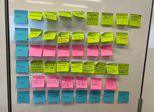
Thinking about our values
We discussed the unique qualities we bring to the team and the values we hold. We grouped these into themes.
Discussing our shared history
We took the time to understand each other and the events and influences that brought us together. This gave us a shared empathy for our individual stories and motivations.
Designing leadership posters
We created posters that described the role of leadership in the design team. This helped us visualise our shared challenges and our goals.
Defining our team purpose
We defined our purpose by asking:
why does our team exist?
what is our motivation day in, day out?
what are we trying to achieve long term?
how does our work make the world better?
Bringing our purpose to life
We considered how we might bring our purpose to life by asking:
what behaviours will bring our purpose to life?
how can we bring our purpose into our day-to-day work?
how can we serve our purpose better?
how can we inspire others around our purpose?
Our purpose statement
“The Design Leadership team enable designers to make meaningful change”
Breaking that statement down, we intend to:
enable our design team to succeed by helping them to grow in their careers through developing their craft and themselves, and making sure they have the confidence to innovate and challenge in the ways they work
ensure we design in a way that is meaningful, creating the conditions where ethical, accessible and sustainable user-centred design can flourish, in turn benefiting our users and the Co-op
Alongside this we made a set of commitments and behaviours that would help to drive this purpose forwards.
The commitments that design leadership made are to:
try things and be bold
increase design literacy across disciplines (outside of design)
share our vision for the future of design at Co-op
have challenging conversations
define ways to measure design value
share our story (failures and successes)
The behaviours that design leadership will display are:
bravery
openness
kindness
vulnerability
reflection
listening
Conclusion
We haven’t changed how we think about design by doing this. Much of it we already do quietly, and our objectives align to these commitments, behaviours and purpose already. However, by saying it out loud, we have a reference point to guide us as well as a benchmark to ensure our team’s future and culture can be measured.
What’s next
We’re already working on objectives that align to our purpose. We’ll remain open as we keep working.
Our Funeralcare team ran a discovery into how we can help people who are dying, which we call ‘imminent need’. For people in this situation, it’s after the time when it’s advisable to buy a funeral plan (pre-need) and before the time when someone dies and someone arranges a funeral for them (at-need).
To make the most of everyone’s time on the discovery, the team ran a design sprint with 16 people to create a shared understanding of our insight and generate ideas around how we could start to help people better.
Sharing research generated interest in the work
As part of our discovery, we interviewed colleagues and subject matter experts. People were excited that we were looking into imminent need and keen to follow our progress. After our research, we held a playback of our work and explained that our next step would be a design sprint. Lots of our colleagues expressed an interest, including our Chief Commercial Officer, and we were keen to follow up with these people.
What is a design sprint?
A design sprint is a method of generating lots of ideas collaboratively with people spanning different disciplines and business areas.
The ideal number of attendees for a design sprint is around 4 to 8 people. This makes sure there’s enough time for the valuable discussions that happen as part of the process. Usually, if you involve more than 8 people it can become hard for everyone to contribute and feel heard, and the session agenda can become difficult to manage.
Why we chose to run a big design sprint
Our design sprint team totalled 16, including two facilitators.
We were hesitant – it was a big group and we had concerns about being able to get through all the sprint activities and have enough time for discussion. However, we felt we could manage this and there were some good reasons to go ahead with a big team.
We wanted to include the broad knowledge across Funeralcare and avoid extra meetings
Our design sprint team represented skills and knowledge from teams across marketing, commercial, propositions, operations and funeral homes plus design, research and product.
Having all those people in the room meant we could discuss barriers and opportunities in real time and within the context of each person’s role. This also meant we could avoid having lots of additional meetings with people to provide updates or answer any potential unknowns.
We wanted our colleagues to get the experience of being in a design sprint
The main value of a design sprint is the rapid validation of ideas, but there is also huge benefit in bringing engaged stakeholders on the journey and the relationships we can develop in collaborative sessions.
Our purpose wasn’t to bring in people who didn’t want to be there or would likely be disruptive to have in the session. It is still a good idea to push back on unreasonable requests to take part where it is likely to negatively affect the session and outcomes you want from the design sprint.
We also wanted to make sure all six of our ‘imminent need design team’ could come along. We put a lot of emotional investment into the research and it was important to make sure everyone got to see the discovery through to the end. Plus having the balance of designers in the room also helped with managing the flow of the day.
For some people, this was their first design sprint. For most, it was the first sprint since COVID changed how and where we work. Bringing people from across the business to work together in person is a powerful thing and it was incredibly valuable to showcase that.
How we ran the design sprint
We chose to run the design sprint in person as we felt it would be easier logistically and would provide the fun design sprint experience that we wanted people to have.
We followed a format similar to Design Sprint 2.0, which condenses the traditional 5-day format into 4 days and only needs the full group for the first two days. By shortening the time, we hoped to make it easier for people to attend without the need for lots of diary juggling or planning months in advance.
Our sprint team included our core project team of design, research and product, plus 9 people from around the Funeralcare business. We had two facilitators to support the large group (and each other). We spent one and a half days together as a larger group, then the core team continued remotely for the final days of prototyping and testing.
Day 1 (half day): Understand
We wanted our design sprint team to have a shared understanding of our research and insights. To do this we shared:
a simple journey map
a clear problem statement based on our research
lightning talks on different aspects of the research
During the lightning talks we asked the team to generate ‘how might we’ (HMW) statements around the problem areas.
We did not have time for everyone to present back all their HMWs, so we summarised themes, asked everyone to add their HMWs to a theme and dot voted on the most important themes.
Day 2: Diverge and converge
After recapping on the themes, we did 2 rounds of ideation using a 3-step sketching process. Usually, we would give each person 5-10 minutes to present their ideas back, but this could have taken a full day which we did not have. Instead, everyone discussed ideas in pairs or small groups and then fed back to the group for a wider discussion.
We originally planned 3 rounds of ideation, but we had so many great ideas from the first round, that we realised we would cover all the themes with 2 rounds and make better use of the time.
The 3-step process included:
Mind-mapping
Rapid 8s
T-bar sketching
In the afternoon each person picked an idea from the morning that they found interesting and presented it back to the group for feedback.
The group then dot voted on the ideas. We gave everyone 3 blue dots to vote on the ideas they wanted to take forward the most. We then gave everyone pink dots to vote on anything they thought had been missed. The blue votes tended to focus on things that were practical and that people were more sure about. Some of the themes that only had pink votes, were ideas that were more experimental or things we’d not tried before.
Day 3 and 4: Converge continued, prototype and test
The core project team continued the rest of the sprint remotely. We focused on narrowing down what we were going to test then set to work on the prototype which we tested with some of our funeral home colleagues.
Outcomes of the design sprint
The design sprint was a great success. We generated a broad range of ideas, some we tested successfully and some that will contribute to future workstreams. We have since released guidance content for a person who knows they are dying and someone supporting a person who is dying. This is the first small step in what we hope will be many more in helping people with this need.
And importantly, there was a feeling of togetherness and brilliant discussions happened in the room. The agenda was tight, but the pace of the day kept energy levels and engagement high.
We had brilliant feedback on the sessions. It’s exciting that people are reaching out to ask if we could help them run design sprints or similar ideation workshops for projects in their own teams.
Our tips for running a large design sprint
Have two facilitators
Having more than one facilitator for a session this large is a must because it:
makes it easier to keep an eye on time and make any agenda changes, whilst helping people in the room and listening to conversation
helps manage energy levels of facilitators as you can switch between the two roles above and lead different sections of the day
means the facilitators are supported by each other
Be mindful of group mix and personalities
Strong personalities can create challenging workshop environments and the more participants you invite, the risk increases that you have one or more people who might (unintentionally) derail your well-planned agenda. We were lucky that we knew none of our participants were likely to behave this way, but it is something to be mindful of when expanding your participant list.
When you start adding more stakeholders or subject matter experts, it’s good to increase the number of designers (or others with design sprint experience) to support with guiding people who’ve not done workshops like this before.
Run it in person
This sprint would’ve been extremely difficult to run remotely, would’ve felt much more rigid and we would’ve missed the pockets of great conversation that ripple across a room when people are together.
One of our subject matter experts travelled to Manchester from Devon and we were very grateful.
Plan your sessions and agenda out in detail, but be ready to adapt on the fly
Our agenda and timings were planned in detail and we made the timings for every activity visible to everyone. On day 2, after getting through more ideas than expected, it felt like the energy could drop if we did more sketching. We tweaked our afternoon agenda to finish the day with a dot voting exercise we originally planned to do asynchronously.
Send out pre-reads or homework
We knew we would not have time in our sprint to recap on what a design sprint is so to deal with this, we sent out a short one-page explainer document to all attendees and asked them to read ahead of the session.
One or two pages of pre-reads or homework can be good ways to get around session time constraints.
Set clear ground rules
This is good advice for any design sprint, but more important here. Some of our rules are:
keep to time: give everyone in the room accountability for arriving after breaks on time and wrapping up tasks when the timer runs out
no multitasking: full focus on the sprint in the sprint, use breaks for checking emails if required
Don’t feel you have to stick to a traditional design sprint
Design sprints don’t have to be 5 days long and not every activity has to be done ‘by the book’. If you have limited time, be really clear about what outcomes you can get to in the time and plan accordingly.
If you want more help with facilitating, have a look at the facilitation guide on the Experience Library.
What we learned overall
When we set out on this discovery, we wanted to find ways to help people who know they are dying and their families. We rely on doing 1-to-1 user research to gain a deep understanding into the problems that our customers face. In Funeralcare it helps us to learn about the complex emotions that people are experiencing when they need to arrange a funeral plan or funeral.
What was different about the ideation stage of our imminent need work was the variety and size of our design sprint. We learned that, done the right way, running a large design sprint meant we:
progressed our ideas and work much sooner than we would have otherwise
saved significant amounts of time and money by reducing the need for multiple individual meetings over months
introduced our wider team to design ways of working which, along with a wider focus on this, has led to more people wanting to work in this way
developed even stronger relationships with a wider range of our colleagues and teams, which we’re continuing to build on
When we put out the call for this big design sprint at short notice, we did not expect so many brilliant colleagues from different parts of the business to sign up. Everyone who was involved fully embraced the process and the ideas and outcomes are stronger as a result.
There is lots for us to work on in this space, but some ideas come with technical challenges. Our first small step was to create guidance content for people needing help with planning:
Whilst the team exploring it has been designer-heavy at times, we’ve considered the wider implications for our wider data and technology teams too. That means we’re talking more about digital sustainability more the specifically designing responsibly now.
What we prioritised
Our early conversations surfaced a lot of potential opportunities, as well as things that could block us doing them and many unknowns that need more investigation. We spent along time just figuring out where to even start.
We did several workshops alongside sustainability experts that helped identify some distinct needs that we felt we could meet as a group. These were things that we found holding us back from working more sustainably in our teams personally, as well as what we had seen or heard other organisations doing. We decided to:
create a written artefact to act as a reference point for what we wanted to achieve
collect data to benchmark our current position
create awareness and increase literacy of digital sustainability at Co-op
Each of these aims took a slightly different approach over the last 12 months:
Creating a written thing
We initially explored creating a ‘strategy’ for digital sustainability. As we talked, and learned from others, we continually returned to our aim of seeing actual change in how teams work, and questioned whether a strategy was the right approach.
The aspiration was to create something that:
could be a point of reference for teams to use, to enable them to start making changes in their own work
made our commitment public, so we are more likely to hold ourselves accountable to it
acted as a conversation starter with people who have not considered the topic
enabled us to collect feedback about what does and doesn’t make sense to teams as they read and try to use it
Our accessibility policy is a good example of something that has achieved similar goals. It is widely adopted across Co-op design teams, acting as a minimum expectation for our work. The policy is promoted and updated by our accessibility champions, who collectively run training to raise awareness and improve practice in the design and engineering team and beyond.
Inspired by the policy format, Marianne brought her content design expertise to creating a draft document that communicated potential opportunities for change. Whilst still a working draft (that isn’t public yet), the document now covers:
Why we have a digital sustainability policy
Things we can do to increase digital sustainability and reduce energy demand
Ways of working
Design, engineering and development practice
Supply chain
Hosting
Equipment
Data and storage
What we are already doing
Responsibility for digital sustainability
Awareness of the digital sustainability policy
Help with sustainability
How we will measure the success of the digital sustainability policy
Information and resources on digital sustainability
Benchmarking our websites
One thing that stalled progress early on was that we didn’t have any benchmark for how sustainable our current digital products or technology infrastructure was. It is still a work in progress, but we do now have a better idea of what data we do or don’t have, and who manages access to that data.
Co-op has multiple customer and colleague facing websites that total an average over 28 million hits per month, spread across a wide range of individual pages. Using Website carbon calculator we measured the carbon intensity for key pages across different businesses.
We calculated that 28 million hits on Co-op websites roughly equates to 75 tons CO2 equivalent a year.
More detailed performance data helped explain why different pages had different scores. There was a very strong correlation between standard performance metrics (page weight and speed) and the carbon intensity of each page.
At the time we collected this data:
www.coop.co.uk emitted 0.22g of CO2 equivalent every visit. The total page payload was 1.99mb, the largest Contentful paint took 1.6s
Whereas www.coop.co.uk/funeralcare emitted 0.55g of CO2 equivalent. The total page payload was 2.84mb, the largest Contentful paint took 5.5s.
In part this demonstrates the close link between sustainability and performance, as well as accessibility, usability, and cost etc. Sustainability is not just a moral obligation that works against our other priorities, done well it supports many of the other good practices we aim for.
Benchmarking our internal data storage and file sharing
Based on research and other advice, we knew our internal data storage and sharing tools would have a significant contribution to our digital footprint. At Co-op this mostly means Office 365. That includes SharePoint, Exchange (emails) and Onedrive. Fortunately we found that our ‘Domain Principal for Collaboration Services’ – the person who knows everything about our Office 365 usage had already deployed the Emissions Impact Dashboard for Microsoft 365.
This, combined with other data we already knew as an organisation told us the following:
We currently have over 195 terabytes of data held in Microsoft servers
The energy to run our allocation of Office 365 servers has generated over 294 kg of CO2 equivalent in the last 12 months
The manufacture and shipping of those servers has generated over 46.5 metric tons of CO2 equivalent in the last 12 month
There are already plans to reduce the data we store by reducing the amount of time we retain data that people have deleted. Because its data people think is already deleted they likely won’t even notice the change, but it will have a significant impact on our storage needs.
Whilst imperfect, the combination of these two data sets enabled us to make what had previously been abstract conversation into more tangible impact. When you’re talking in tons of carbon dioxide equivalent based on your own data, it’s harder to ignore.
We still plan to explore the following tools to build out what we know using:
Alognside this we’ve also started conversations with the providers of other tools e.g. Miro to find out what they know around the energy intensity of their tools, and the data that we as an organisation store with them.
Raising awareness
This was probably the one we were least pro-active about. Whilst there’s been a committed small group of people that we’ve tried to galvanise, its not spread much beyond that core team. We have an open slack channel on all things #sustainability and a dedicated #sustainability-champions one. We’ve held community of practice style sessions where we’ve either developed and reviewed the policy or invited external speakers to share their knowledge and work.
Trying to free up people’s time can also be a challenge and we prioritised progressing things, and seeing change happen, over boosting attendance for now. There may come a time where the opposite approach is needed to continue seeing the desired change.
Work that is already happening
Much of this work has been pulling together existing threads of change that is already happening. For example, the surge in energy costs over the past 12 months meant it became a priority for teams to identify opportunities to save energy, and more of these had a worthwhile payback because now the potential cost of energy was greater than the time it would cost us to make the changes. For example:
By the end of 2023 all Co-op self-serve tills in stores will be powered down centrally overnight and then switched back on an hour before opening time. This is projected to save over 1.5 million kwh (290 tons CO2 equivalent) and over £500,000.
Decommissioning a large SharePoint site that was no longer in use is projected to save approximately 40,000 kwh and over £15,000 annually.
The engineering team for ‘Shared Digital Services’ have explored how they can make better use of their AWS infrastructure that supports their products. Initial experiments show a saving of £23 a day, or over £5000 by December 2023, they have not calculated the expected energy saving yet.
None of these examples have directly come from the creation of the policy but serve as reference points for the opportunities that exist across our teams when we pro-actively seek out ways to be more energy efficient and use our design and development skills to make changes.
What’s next
Sharing this work with our Digital, Technology and Data leadership team generated good conversation, questions and generally showed appetite from them for more, but the real change needs to happen within teams.
We had some feedback around whether a ‘policy’ was the right way to position the document we had created, but the response was overall positive. We’re hoping to move continue developing it and ultimately publish as some form of ‘guidelines’. Watch this space.
In the meantime, the main aim is to actually see change happen, teams taking initiative to reduce the energy consumption of their ways of working and the products they design, build and manage. We suspect this will be partly driven by the policy or guidelines that are sponsored by leadership, but equally (if not more so) through individual’s personal motivation. To boost this, we delivered a session as part of our internal Digital, Technology and Data team conference in June, and have planned community of practice sessions to help spread the word.